
BCT Brand Guide
Intro
- Use the side menu to navigate to the relevant section
- Download logos and fonts under "Download Assets"
- Follow the do's and avoid the avoid's in each section
- Not sure? Write to marketing@bct.dk
Brand Essence
Den mest
människa
AI
företag i världen.
We do not start with hype. We start with the work itself. We look at how people actually operate, where friction happens, and what would make technology genuinely useful. From there, we build solutions that make sense in context and can live in real operations.
Logo

This is the preferred and default logo. It should be used whenever space allows and whenever the full brand name needs to appear clearly.
Use the primary logo for:
- website
- presentations
- proposals
- case material
- most branded surfaces
- social content where space allows
This should always be the first choice. And should be - if possible - placed bottom left.

This version is used when the primary logo does not fit or when a more compact expression is needed.
Use the secondary logo for:
- small digital placements
- profile images
- favicons
- compact layouts
- situations where the full logo becomes too small to read
Use this only when the primary logo is not practical.

The wordmark can be used in selected cases where the symbol-led versions are not suitable.
Use the wordmark only for:
- narrow formats
- specific layout systems
- branded compositions where the full name needs emphasis
- approved applications where the symbol would create imbalance
This is not the default logo and should be used selectively.
When choosing a logo, always follow this order:
- Primary logo: BCT symbol + wordmark
- Secondary logo: BCT symbol only
- Wordmark only, if the first two are not suitable If a dark background is used, switch to the inverted version of the same logo.
When in doubt, use the full primary logo. Only move to the simpler versions when space, readability, or format requires it. The goal is not to maximise variation.
The goal is to use the most complete and recognisable version possible in each situation.
Avoid the following:
- adding drop shadows
- applying outlines
- changing colours
- distorting the shape
- placing the logo on busy backgrounds without enough contrast
- using low-quality exports recreating the logo manually
Logo assets can be accessed here: BCT Logo Drive Folder
Tone of voice
-
Clear
-
Direct
-
Human
-
Smart
-
Practical
-
Playful
-
Personal
-
Sharp
-
Confident without trying too hard
-
Overly corporate
-
Buzzword-heavy
-
Robotic
-
Vague
-
Overwritten
-
Generic "AI future" language
-
Consultancy theatre
How we do it in practice
Color Palette
Color Usage Distribution

Use accent colours to guide attention, not to fill space. When everything is highlighted, nothing is highlighted. Use Signal Lime for the single most important data point or takeaway.
Gradients
-
Brand surfaces
-
Backgrounds
-
Hero sections
-
Selected large-scale visual moments
-
Small UI elements
-
Behind small text
-
Compact interface components
-
Places where readability is reduced
74% → #1C2D7C
100% → #111827
LINEAR · 135°
52% → #362242
75% → #775B87
100% → #281532
LINEAR · 135°
52% → #656256
75% → #8E8B7F
100% → #656256
LINEAR · 135°
Use gradients to create mood and dimension, not decoration for its own sake.
Typography
Google Sans
Used for headlines, body copy, UI, website, presentations, and sales material. Available free via Google Fonts - easy for everyone to install and use. The primary typeface should feel clean, modern, readable, and confident.
Yuji Boku
Used very sparingly for single-word emphasis, conceptual highlights, and special brand moments — such as the word människa where there is a clear design reason. This typeface is an accent, not a system font. Available free via Google Fonts.
Type scale
Display
Display
Display
Heading 1
Heading 2
Heading 3
Body text - large variant for ingress and important paragraphs
Body text — standard paragraph for running content and descriptions
Body text — small variant for footnotes, captions, and metadata
EYEBROW / CATEGORY
LABEL TEXT
Art Direction & Imagery
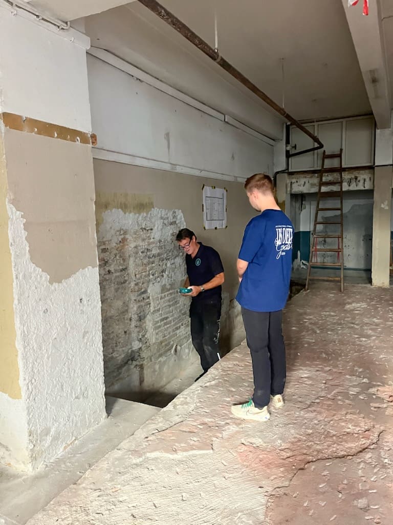
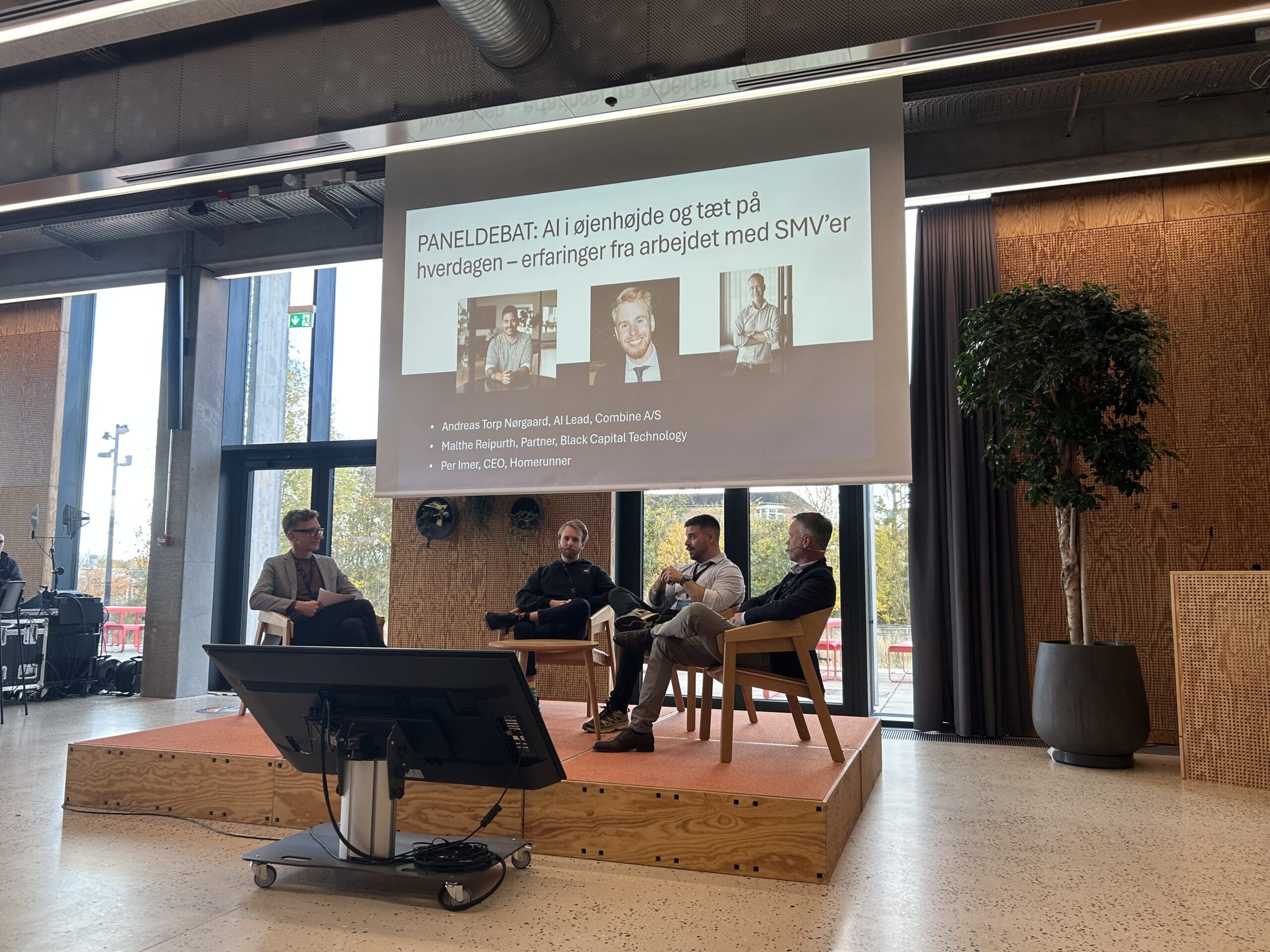
Photography Style
-
Use high-quality, authentic images
-
Show real employees and everyday life
-
Highlight natural collaboration
-
Use relaxed imagery where it supports the culture
-
Show technology in realistic environments
-
Generic stock photography
-
Artificially posed office scenes
-
Overly formal corporate imagery
-
Blurry, grainy, or low-quality images
-
"AI company" cliché imagery
Contextual Use
- Build trust through real people
- Prioritise authenticity over perfection
- Feel immediate, human, slightly informal
- Still intentional and on-brand
- Support the story, not fill space
- Reinforce credibility and context
- Fewer, stronger images
- Good composition, clear at large formats
How we do it in practice


Download Assets
All logo variants — white, dark, and compact versions
Both available free via Google Fonts — easy to install for everyone
Brand-approved slide decks ready to use and adapt
All case study materials — Drive folder and editable Figma file
Branded closing animation for video content. Available in desktop and mobile format
Build your own branded email signature in a few clicks — consistent across the whole team
Look sexy on your linkedin and be a part of the group by adding the BCT banner to your profile.
Download the BCT business card template. Need a business card or have questions? Write to jkm@blackcapitaltechnology.com
Brand-approved photos and video assets — for use across presentations, website, social media, and other BCT communications. Always use these over generic stock imagery.

